Research into Professional Instagram and Websites
Instagram Research:
• Sebastian.merk.art (Painter)
• Shelliegarberart (Painter)
• blue_cormorant (Art Gallery)
• tzieglerart (Artist)
• michael_allow_ (Painter)
• dirkbartnik (Artist)
• tyson_ee (Artist)
• semartistry (Artist)
• kanaknanda (Mural Artist)
• art_by_bezmo (Artist)
• van.odar (Abstract Painter)
• guimbellot_paints (Painter)
• Jessebellm (Painter)
Reflection:
The most successful instagram pages have a strong element of cohesion and by having a strong visual identity tying the images together by a thread. These can be implemented in a variety of ways: either using the same, or similar, colours in each image to have "brand colours" or "identifying colours", by using identifying mark-making, by using a similar background or parameters (white space or a coloured border), similar scale of art (which is similar to the backgrounds appearing), using the same shapes, which can include the artist themselves in the image each time.
One thing I like is showing how art can live within a variety of contexts. Shellie Garber, for example, shows her work situated in different environments to give the full visual effect: against a white frame / the illusion of a white wall / "the gallery space, hung in different spaces - digitally edited into stock photos, and the piece up close with no borders. There is conitinued careful consideration and curation of her instagram page and how the artwork is situated within the page.
Instagram very much becomes a digital portfolio. There's a harmony in the colour palette and an association / visual identity with the artist. It is very immediate as branding and visual identity and someone can quickly be found through hashtags.
Website Research:
• Sarah Schroder's desktop website is much more digestible than her mobile site where there is too much information on the home screen at once all in one scroll
• There is a coherent colour palette of peachy coral, white, purple and green
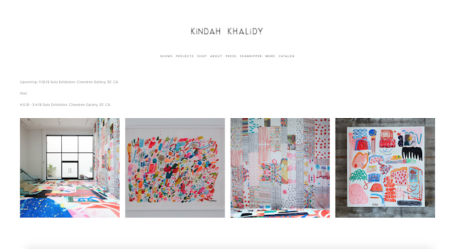
• Kindah Khalidy: Simple and powerful website as portfolio and shop
• Minimalistic. No design problems as a result
• The work itself does the talking.
• https://saraschroederart.com/
• https://www.artbyalison.store/
• https://www.kindahkhalidy.com/
• https://blueboomerangart.com/
• http://www.raymondlhaywood.com/
• https://tonithorntonart.com/
• https://www.vousetesuper.be/
• https://www.lisamatthewabstract.com/
Common themes:
• Oftentimes very simple / minimalistic making use of white spice
• Portfolio style
• Professional photos of artist in studio on homepage
• Instagram preview
• Newsletter / mailing list (with promotional code to use in online shop)
• Sometimes a blog is included
• Carousel of art
• About section / mission statement
• FAQ
• Contact
• Shop/often powered by Shopify
• Shows / Exhibitions
• Sometimes payment plans are offered for larger painted canvases costing thousands of pounds
• Testimonials
Reflection:
Simple is best - the more content a website has, Sarah Schroeder's for example, the more overwhelmed I personally feel and don't know where to start looking. (Her website is much better viewed on desktop where the content is speed out. On mobile it is on continuous scroll of information on the main page and is quite a lot to take in!) mission statement provides a concise overview for what an artists' aims and intentions are. An 'about me' section is also good to learn more about the person behind the artI like when the artist comes through the website and it isn't just a company. Authenticity and making a connection. Art is about the artist and their story.Portfolio style overview is a great way to present work online without the need for a physical portfolioI would love to have a video showing how I work as a blind person. This would require a number of things:an identity/logo to attach to the video and marry to the websiteSome kind of filming equipment and editing software. May be best that someone does this externally Studio space with pieces displayed. To work on my appearance a little bit as I have a lot of hang-ups after the pandemic and my Guide Dog's absence
If this at any point gets too difficult for me, there are a number of options available for logo and website design. I'm truly doing my best with the tiny amount of vision I have left after double retinal detachment, but digital creativity is no longer my forte (photoshop etc) and I struggle so much as it isn't accessible, thus turning to painting
• peacockcarter.com - website design agency based in Yorkshire so would be supporting locally.
• Reason Digital - based in Manchester. They worked with Henshaws Society for Blind People when I volunteered there as a service user, so I know them through an element of experience and trust, and that they would be successful through an accessibility angle which matters to me.
• Marvellous Agency based in Leeds. Supporting locally who have a strong portfolio.
• https://madebyshape.co.uk in Manchester. Supporting from my home city.


No comments:
Post a Comment