Friday, 31 July 2020

LAUIL502: Studio Brief 2 - Formal Presentation

Presentation Slides as a PDF document

Transcription


Slide 1: I’m Kimberley Burrows and this is my presentation reflecting on this very difficult academic year of Level 5, deconstructing the continuing evolvement of my professional practice and the interests that inform it, detailing some of the noteworthy "eureka moments" that developed and furthered my skills, and discussing where I would like to take my practice next year during Level 6 and beyond.


Slide 2: In order to move forward into level 6, I need to reflect upon the past few years and give consideration to the kind of practitioner I started out as and the ways in which I worked, so I can identify my development this past 10 months. Coming from the Access to HE course and going into University as an older student with a disability, I really wanted to prove myself and take every opportunity to do my best resulting in me being very meticulous and careful. I didn’t want to make mistakes or "get things wrong", I was every inch a perfectionist. I was very scared to try new processes and new ways of thinking that were unfamiliar to me as I was older and set in my ways.

University enabled me to access a lot of new methods and processes I hadn’t used before, but I was still very apprehensive to use them at their full potential. I wouldn’t allow myself to be as experimental as I could have been to best ensure my final results were always balanced and aesthetically pleasing. Everything had to be planned out and be tackled in a methodical way. I felt I was making some progress during my first year at level 4 but I was still very closed off to showing my vulnerability as an illustrator and as a person; not wanting to make quick work, expressionist sketches or playing with tone of voice. I wanted everything to be the best it could be and I was dead set on being a children's book illustrator with little room for consideration of any other types of illustration. I wanted to prove to myself, to my tutors and to my family that someone with a severe sight-impairment, struggling with depression and terrible anxiety, could indeed produce outstanding work at university level. I didn’t want my vision to hold me back in any way and I worked each and every day for over 8 hours. I was an overachiever, wanting the highest grades I could possibly get with my time and efforts.

It burnt me out at the end of Level 4 and, upon reflection, this was not a sustainable way of working and building my practice. It was not enjoyable, I was not having fun and I started to dislike the course. Last academic year at Level 4, I created very beautiful outcomes but I also felt very unfulfilled. Pictured in the slide is my meticulous approach to using Adobe Illustrator to create a sticker design, posted to my blog and recorded step-by-step. Also seen is my Pearly Kings and Queens book for the Visual Narratives module, with plenty of symmetry and balance, and a personal commission by Guide Dogs for the Blind Association to create a Christmas card and matching envelope to send to their patrons. All very pretty, but ultimately with nothing distinctive of me in them. A lack of authenticity and an unsureness in myself as an artist.

The way in which I worked focused primarily on a digital approach with Photoshop and a Wacom Tablet but I also liked to use the method of cut paper shapes, scanning them in and using Photoshop to rearrange them with my own handmade textures - marrying the analogue and the digital. Everything was ordered symmetrically and had a harmony to it. This came from my need for perfection.


Slide 3:  For the final module of Level 4, which was a precursor to "About the Author" in Level 5, I really started to let go of a lot of meticulousness in my practice and approach. Looking to Zaha Hadid's architecture, I noticed her use of organic forms and how she was inspired by the locations in her upbringing that featured sand dunes and roots and flora. As she was an architect, her work immediately made me think of schematics and computerised drawings but also small-scale models and maquettes. I was starting to think in a different way by investigating an artist I had never considered looking at. This pushed me out of my comfort zone to work in 3 dimensions, rather than just on the page. There was something therapeutic and magical about being able to put my small amount of vision to the side and concentrate on how something feels with its tactile elements. This was my first introduction to working in 3D and I worked with clay to combine a natural, organic experience with an analogue approach. I enjoyed the challenge of translating something from the page to a tangible form. That then allowed me to open up a new set of questions for myself instead of revisiting the familiar and the comfortable. 

That was an exciting jump-off point – what could I do now? I could try out different approaches and techniques. For the first time I considered photography as a response opening up my discipline further and expanding my skills. My mind began to race and I was hungry for new processes; making vac forms of the clay sculptures, photograms of natural forms found in fruit and vegetables, and schematic grids in Illustrator. I overlaid these together to make a new visual language that was distinctly Zaha Hadid but also playful and evocative. This was the new starting point of experimentation.


Slide 4: My own personal experiences these past few years have changed the way in which I approach my work, too. I've greatly struggled with my mental health and developed an eating disorder when I came back from Uganda in the summer of 2017, witnessing a harsh way of life out there for adults and children alike with the bare minimum of anything. I was exhausted from 2 years in Access to HE and Level 4, and took the academic year out to rest. During this time I developed a stronger interest in music, finding what is now my favourite band, and falling in love with band branding, logos and merchandise featuring distinct illustrations, costuming and live concert photography. 

I have dealt with a lot of trauma; My mum had a severe stroke in February 2018 and both of my retinas detached later that year in September and December 2018. My changing and diminishing vision, destructive coping mechanisms and being thrown headfirst into a new life of being entirely independent with no family to help me means I have changed entirely from the person I was in the past. I used to seek approval and praise from my loved ones in a childlike way. Now I no longer have a family unit and a support to seek any praise from. I am isolated and alone. I am now trying to exist every day in the quarantine and not let bad thoughts win, trying to be resilient, and I'm battling a lot of demons every waking hour. I no longer seek any approval for myself or the work I do and don't focus on creating the best outcome I possibly can. At times I give up on myself entirely. Now I am just trying to survive and find any kind of emotion that isn't despair. I've found I no longer have an interest in the children's books I used to adore as I do not find the comfort in them that I used to. I now rely heavily on music to be my therapy and comfort and to help process my inner thoughts and feelings.


Slide 5: Over the duration of the quarantine and self isolating, I needed an escape and something to focus on from being stuck inside. I've always wanted to explore The Beatles' back catalogue but never had the time to do so - now I had plenty of time! I really found myself transported to another era through their early, muffled recordings of positive, catchy pop rock, to folk and soul, to outright psychedelia and art rock. They were the soundtrack to swinging 60s culture, the ultimate trendsetters and had an interesting linear progression; going from 4 young clean-cut local boys who evolved their image and sound informed by their experiences of travelling the world and experimenting with drugs. Their later compositions became more innovative, more lush, with multiple layers of playful sounds creating an intriguing ambience. It gave me a nostalgia of an era I wasn't even alive in and reinvigorated my interest in life and learning.

I saw parallels of their progression in myself of how I started out my practice as someone staying within the rules and not exploring beyond what was comfortable, to then being changed by life experiences, age and travelling, and a need to express myself in a more loose language.

I learned about the history of the vinyl covers for each record and how it informed a visual language of its own. The "Rubber Soul" era particularly interests me both musically and artistically. It was the first record of theirs not to feature their name, a testament to how big they had become. The font was created by Charles Front who was influenced by the album name and produced something akin to the globules from a rubber tree - starting narrow and then filling out. The rounded letters used on the sleeve established a style that became ubiquitous in psychedelic designs and a staple of poster art for the flower power generation. The elongated photo was entirely an accident when photographer Robert Freeman projected the image for the band onto cardboard but it fell slightly backwards.

This history of the vinyl is intriguing and showcases how the Beatles continued to test the limits during this time - something I wish to do with my practice.


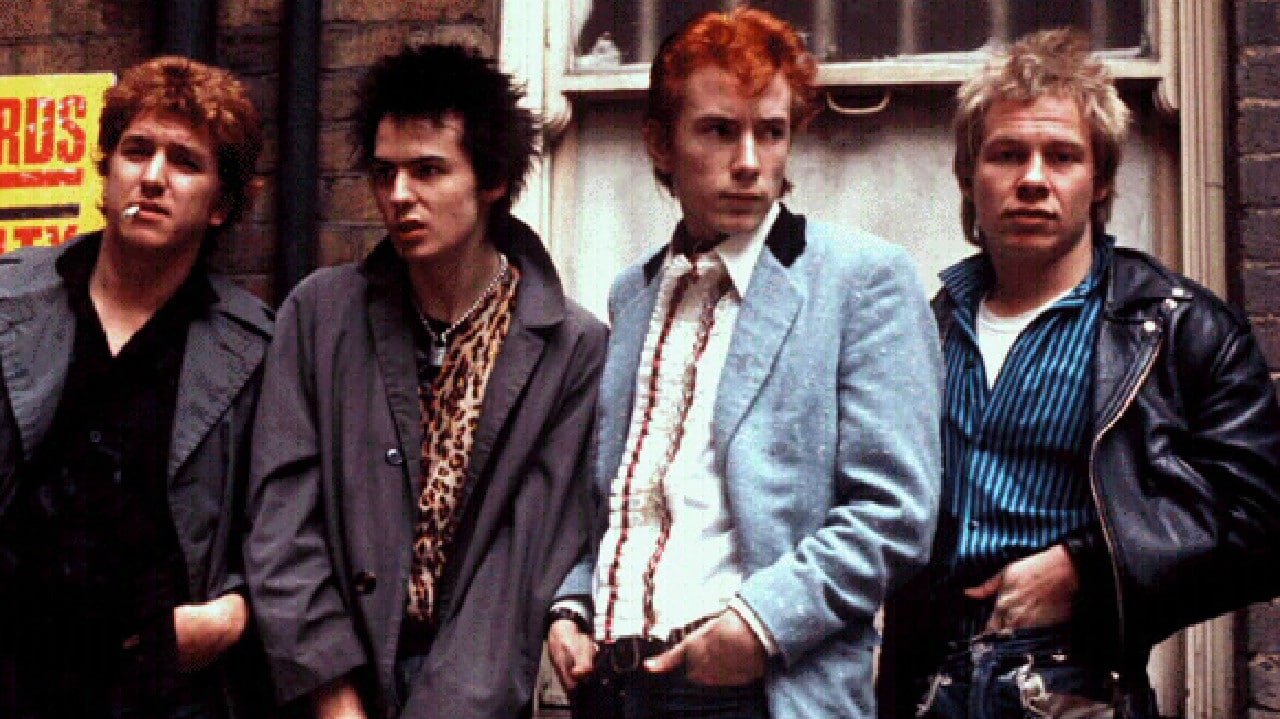
Slide 6: Similarly, I also have fallen heavily in love with the Punk movement of the late 70s - again providing an escape during this stressful time of self-isolating during Covid but also peaking my emerging multidisciplinary interests with the marriage of music, fashion, photography, live shows and attitudes. The music of the Sex Pistols, the fashion of Vivienne Westwood in her SEX clothing store and the DIY, "fuck it" attitude are a far cry from the things I enjoyed during level 4 a few years ago but are strongly influencing my work and rejecting excess and perfectionism.  


Slide 7: A big illustrative influence this year was the practitioner Este Mcleod. I was really drawn to the colour palettes of green and blue and how she was inspired by motifs of flora and fauna and natural forms, just like Hadid. I was drawn to the unique voice in the shapes, pattern, texture and repetition. The textures helped to give an ambiguous tone of voice and an interesting visual language. There’s something mystical with the layer building. I wanted to incorporate this in the Agatha Christie work I was undertaking as it married perfectly with the subject of secrets and mystery. I focused on The Murder on the Orient Express and divided it into different motifs that are easily recognisable for Christie - the train, tickets, poison bottles and a magnifying glass. Repeated forms with the use of handmade textures created a mystery like in the book and a nod to McLeod.


Slide 8: The biggest contrast in the Kimberley "then" and the Kimberley "now" can be seen in part of the Process and Production module with the brief, "About the Author." I started this brief twice as the first attempt at Level 5 ended abruptly with my mental heath issues and the second attempt with my retinal detachment, surgeries and subsequent recovery.

The left side illustrates how I used to work, heavily informed by narratives such as children's books and a fondness for characterisation and composition. The right side showcases my now more experimental approaches, informed by Este Macleod, imbuing their way of working into mine with repeat pattern motifs, textures and the use of green and blue in the colour palette to contextualise the poison used as the common murder weapon in Christie's novels. Previously I worked digitally to create this perfect structure and character. Now I collected ephemera from packaging and cut them into simple symbols, building up and collaging with textures in monoprinting to create an ambiguous and mysterious tone of voice. It was a process of experimentation and pushing an idea whilst simplifying it into basic shapes that made it successful. For the final booklet, I printed onto acetate so the pages would build on top of each other to create an element of intrigue and almost something puzzle-like - as with the novel. Working from an author allowed me to illustrate from a personal experience and interpretation. In the past I would have focused on solely illustrating the book rather than the experience I had and the feelings I felt.


Slide 9: Developing the front cover for the booklet allowed me to play with type - something I have a growing interest in from the band logos and vinyl covers I admire over these past few years. What I really enjoyed about this process was that the wooden blocks of the type were not perfect. They’d been thrown around, dropped on the floor, and had nicks in them - telling an interesting story themselves. When I hand-printed with them I discovered all these wonderful textures where nothing is uniform, further dissolving that former need for perfection I had. I had this imperfect set of type that didn’t match each other. It created an almost "punk" aesthetic, whilst retaining the aesthetics of a classic typewriter and font, giving connotations of a ransom letter. Arranging the type into a weird composition was very rewarding and, again, broke my previous goals for harmony that I started to take great pride in.


Slide 10: David Mackintosh is someone that I discovered this year in Module 503 for the Dracula brief. In his book covers shown in the slide, I recognised the ways I used to work within his illustrations using basic shapes, character and composition. I could have easily fallen down the pit hole of creating outcomes like this and the work I used to make. Whilst I took influence from the simple colour palette of white, black and red, I quickly identified that I wanted to be more adventurous in my type and composition.


Slide 11: Undertaking the Dracula brief allowed me to look at different methods of responses by making a gif, creating a typeface and creating screen prints. This allowed me to be more open and accept that I didn’t just enjoy illustration and I wanted to be more multidisciplinary. I enjoyed type, making my own handmade font, and creating a moving image. I had a lot of obstacles with the screen print in that brief. I did a lot of research and different approaches such as photography and playing with lights. I tried to overlay multiple methods like the Zaha Hadid piece but it wasn’t working. It became far too busy and felt like I was throwing everything at it. It got TOO experimental. Simplicity is key to making something effective.

The Dracula brief was different for me and something very special. Experiencing firsthand the music and lighting gave me a different appreciation of other things outside of the visual and a growing fascination of the components that make a live performance and how I can interpret these in my work. I did a lot of live sketching in the dark which helped me think about shape, form, and light - a bit like reportage illustration. When I came to responding to the brief I could think about light and music. I could listen to information about Dracula and vampires in podcasts and music. I was being very open and absorbing lots of different things rather than reading Dracula itself like I would have done in the past. Now I thought about how I felt about the subject? What was my voice?

There was a lot of problem solving, especially with the type - it was like a eureka moment for me. Instead of using the graph paper and a ruler to make the type perfect, I thought "what is my unique response?" I can barely see but I can touch with my hands. I read Braille with my hands, I create with my hands. So, I literally used my hands (and shellac nails that are rather vampiric!) as shapes to draw around. Thinking outside of what I usually did gave me great success. Using these "claw" shapes allowed me to explore marrying the font with a simple composition and some shadowing to allude to the character. It made me excited to create and wanting to push an idea as far as I could go.


Slide 12: I looked to Jun Cen for inspiration when creating autobiographical illustrations last summer, hoping to provide a window into my experiences with my bad mental health - comprising of depression, anxiety, PTSD and an ED - and the thoughts and feelings surrounding such complicated issues. Jun's cold and muted colour palette and empty compositions help to successfully show the isolation, the numbness, the exhaustion. I used these elements in my own responses, using visual metaphors such as being locked in one's own mind, everything being an uphill climb, feeling like I'm drowning in emotion and far from any sort of rescue, and feeling crushed under the weight of everything and like I'm not a part of society.


Slide 13: The trip to Colours May Vary earlier this year, learning how the business is run and displaying my work outside of a university setting gave me a new confidence and an opportunity to witness illustration in a professional context and exhibition space with my peers. It felt really meaningful and extremely powerful to use my most personal works that were created during and depicting a low point in my life, where I felt weak and powerless, now giving the work new context by openly sharing with other people and inviting them to get a glimpse of something very real, something they may not feel open to talking about. It opened up a number of conversations with people going through similar circumstances and that is where I want my practice to go. To be bold, to inform, to share, to connect. I don't think there is anything better or more fulfilling than using negative feelings for a good purpose and hoping it reaches the people who need it most. I would like to create more work like this as a therapy to myself and to help educate and support others. This could lead to working with mental health charities, applying illustrations to support leaflets and posters.


Slide 14: The visit to the Yorkshire Sculpture Park at the beginning of Level 5 introduced me to the concept of experiential art and responding to sounds, smells, touches, collected ephemera, thoughts and feelings for the first time. The idea of collating as much evidence of my experience as possible, through both Tami and I, was very freeing. There was no expectation to create something beautiful at the end of this brief allowing me to finally let go of my need for perfection. Illustration felt fun again for the first time in a long time as the outcomes could be anything from marks to poetry to clay impressions - harking back to the Hadid outcomes from Level 4 where I was multidisciplinary and combining a number of different research methods and approaches for my own visual language. The random outcome with the risograph with two different peers told our unique stories in a playful documentation. This trip was incredibly valuable to me.  


Slide 15: Talking to one of my favourite multidisciplinary illustrators, Sam Dunn, this year has really helped me to understand what it's like working as a professional illustrator in the creative industries and getting started. She has created a lot of work with my favourite music magazines and rock and metal artists and creating a valuable link with her through our favourite band of Ghost is very important for my contact list. As I mentioned earlier, I have really fallen in love with band branding and logos, and their merchandise, giving each band a unique tone of voice and visual language to be recognised by. Looking at her portfolio has given me a sound understanding of the many ways that illustration can be applied to products beyond prints and books.

I have identified two strong interests in music and mental health advocacy during Level 5. 


Slides 16, 17 and 18: From this point onwards I want to be brave and more confident to create work from my own perspective as someone who is blind. How do I see and understand the world? I also want to continue in the direction of creating illustrations surrounding depression, anxiety, isolation and general mental illness, especially at such a time as this where we are closed off from the life we knew. I have a unique voice and I want to use it unapologetically. I will be moving away from narratives such as children's books where I no longer feel a connection to positive stories at this time in my life. I want illustration to be therapeutic to me and have a meaningful connection with an audience. It will also motivate me to create work in the first place during frequent low points where I have loss of motivation. Music and experiences will continue to inform my evolving practice and I will continue to push ideas with experimentation and letting go of my former need for perfection. Onwards to Level 6! 

Thursday, 23 July 2020

LAUIL502: Studio Brief 2 - Presentation Planning

 I need to plan how I would like my Level 5 presentation to be formatted. It needs some kind of continuity without just being a retelling of the year.


Things I want to consider taking about:

• "Eureka" moments from this year; Experiential responses - Yorkshire Sculpture Park and Dracula play, creating own typeface and a moving image developing my skills as a practitioner and becoming more multidisciplinary

• Agatha Christie booklet, playing with type and shape in inquisitive way

• Growing interest in music and vinyl sleeves. The Beatles and Punk. Live shows, concert photography and costume

• Practitioners informing my responses: Este McLeod, Jun Cen, David Mackintosh

• Colours May Vary trip learning of the business and displaying in an exhibition space outside of uni

• Personal work making sense of mental illness. Would like to take this further in Level 6

• Interviewing Sam Dunn and learning of her applied illustrations to magazines, clothing, pins and jewellery

• What kind of practice I had in Level 4 and how it was unsustainable

• Talking of my life experiences and how they have shaped me

• Looking to Level 6 and how I want to develop my practice; illustrating my own unique voice as a blind person, illustrating my mental health struggles with educate and connect with others, using music and a form of therapy or illustrating music related items

Appropriate images:

• Outcomes from mentioned work (Agatha Christie, Dracula, Yorkshire Sculpture Park)

• The illustrations from Este McLeod, David Mackintosh and Jun Cen that developed my own responses

• Colours May Vary exhibition

• Outcomes of how I used to work

Saturday, 4 July 2020

The Punk Movement

As with my experience with the Beatles and a thirst for discovering new music, I also have fallen heavily in love with the Punk movement of the late 70s - again providing an escape during this stressful time of self-isolating during Covid but also peaking my emerging multidisciplinary interests with the marriage of music, fashion, photography, live shows and attitudes.

The music of the Sex Pistols, the fashion of Vivienne Westwood in her SEX clothing store and the DIY, "fuck it" attitude are a far cry from the things I enjoyed during level 4 a few years ago but are strongly influencing my work and rejecting excess and perfectionism.  

• Disenfranchised youth of Britain

• Counter-culture. Youth rebellion

• McLaren, who managed The New York Dolls who made a big impact despite their short time. He turned his interests to The Strand who quickly became the Sex Pistols

• In 1977 in honour of the Queen's Silver Jubilee, the Sex Pistols created "God Save the Queen" - a counter-culture anthem. Rejected and censored by radio stations

• Attacking conformity and deference to The Crown

• Their behaviour during interviews also brought a lot of attention

Vivienne Westwood

• Frequently used tartan, zippers, studs, safety pin, leather, inflammatory words to create a distressed and DIY aesthetic

• Backlash against flared denim of the 60s

• Relationship between fashion, music and counter-culture

• Commodified and marketed the movement successfully with partner Malcolm McLaren (manager of the Sex Pistols)

• Firmly believed in people taking charge of their own fashion and not buying into brands, despite becoming a brand herself

• Intrigued by 50s rock and roll like Elvis Presley and Chuck Barry, vastly preferring over glam rock taking over at the time. Romanticising the 1950s

• Reinterpreted renditions of Teddy Boy fashion

• The Beatles and supergroups of the time were becoming stale and no longer in touch with the youth and their economic struggles

• The New York Dolls' impact was big and McLaren wanted to bring that to the UK

• Punk was about rejecting establishment, being loud and aggressive. McLaren knew he could package this

• Her ever-evolving shop eventually became SEX. A backlash against retail at the time. 

• The main commodity was punk itself

• BDSM culture and fetishism became central to her fashion. Dominated the streets and the charts together

• After the break-up of the Sex Pistols, Westwood would go onto high-fashion with Pirate" which was a great success

• Westwood used her fashion to express her controversial viewpoints

Tuesday, 30 June 2020

Contextual Research - Jonathan Hultén


Jonathan Hulten is a Grammy award winning guitarist, multi-instrumentalist and illustrator from Sweden . Tribulation and his own solo work, taking inspiration from his religious upbringing in a church, inspiration in nature (he cites trees, mountains and the sea as influences that call to him), the Art Deco movement, vaudeville, performance art, horror movies, heavy and death metal music and gothic subculture. He designs all of the vinyl artwork, gig posters and printed ephemera for Tribulation and his solo project using ink pen and editing in Photoshop; marrying the digital and the analogue. 


He has a multidisciplinary and open practice combining music, illustration and graphic design, costume, makeup and performance. I like that it's such an open discipline where everything translates and centres around his music.


He is heavily informed by metal music and horror movies which makes him relevant to my emerging practice and the direction I would like to go in my professional career. 


I particularly like his simple shapes and colour palette, often working with cream, black and red, and very elongated forms reminiscent of Art Deco and all the things that symbolises including elegance, culture, sophistication and youth. 


More and more I am becoming inspired and informed by music in my practice and n longer enjoying children's book illustration like I once did. It no longer brings me the comfort that it once did, I find only pain where an old interest lies that reminds me of when I was happy before my trauma. Music is now my comfort blanket.

Tuesday, 23 June 2020

The Beatles


Over the duration of the quarantine and self isolating, I needed an escape and something to focus on from being stuck inside. I've always wanted to explore The Beatles' back catalogue but never had the time to do so - now I had plenty of time! I really found myself transported to another era through their early, muffled recordings of positive, catchy pop rock, to folk and soul, to outright psychedelia and art rock. They were the soundtrack to swinging 60s culture, the ultimate trendsetters and had an interesting linear progression; going from 4 young clean-cut local boys who evolved their image and sound informed by their experiences of travelling the world and experimenting with drugs. Their later compositions became more innovative, more lush, with multiple layers of playful sounds creating an intriguing ambience. It gave me a nostalgia of an era I wasn't even alive in and reinvigorated my interest in life and learning.

I saw parallels of their progression in myself of how I started out my practice as someone staying within the rules and not exploring beyond what was comfortable, to then being changed by life experiences, age and travelling, and a need to express myself in a more loose language.

I learned about the history of the vinyl covers for each record and how it informed a visual language of its own. The "Rubber Soul" era particularly interests me both musically and artistically. It was the first record of theirs not to feature their name, a testament to how big they had become. The font was created by Charles Front who was influenced by the album name and produced something akin to the globules from a rubber tree - starting narrow and then filling out. The rounded letters used on the sleeve established a style that became ubiquitous in psychedelic designs and a staple of poster art for the flower power generation. The elongated photo was entirely an accident when photographer Robert Freeman projected the image for the band onto cardboard but it fell slightly backwards.

This history of the vinyl is intriguing and showcases how the Beatles continued to test the limits during this time - something I wish to do with my practice.

Sunday, 21 June 2020

LAUIL502: Studio Brief 1 - Study Task 2 (100 Word Reflection)

 Sam Dunn's work sits strongly within the arts and design sector, proudly showcasing a vast portfolio of print, sculpt and merchandise for brands, bands and her own personal shop. She has a strong online presence through her website, blog, Tumblr and instagram. Sam's practice is of great interest to me through our shared love of music, enjoying the same bands, sub-culture and aesthetics. Looking to Sam is relevant to my own professional development to see an illustrator, with similar interests and influences, applying blended analogue and digital approaches to a range of products for band merchandise and music magazines.

Own personal reflection (203 words)

Receiving Sam's answers and hearing her journey through her professional career has inspired me to really make my dream a reality. While our personal battles are different, and Sam doesn't struggle with blindness or a lack of motivation due to personal circumstances, creating a steady flow of work over the years, our love of music unites us and inspires us to create to sound. I didn't quite get the answers I was expecting with the AOI or contact list questions but we are all individual and there's no strict set of rules on how to be an illustrator. This does not stop me from making good use of these tools and resources while I am still developing my practice. Sam's strong work ethic and tireless production of applied illustrations to products in a landscape I'm genuinely interested in motivates me but also challenges me. Sam would become competition to potential jobs for myself and I need to be able to create as much frequent output with a strong, individual voice that is easily recognisable and can be applied to a range of items. I need to have as strong of an online presence and to consider having an agent to help find jobs. 

Friday, 19 June 2020

LAUIL502: Studio Brief 1 - Study Task 2 (Interview with Sam Dunn)


• How long have you been illustrating for? When did you realise you wanted to do this full time as a job?

I loved drawing from a young age, but started doing it more seriously at college when I began working on posters and t-shirts for bands. I decided that after school I wanted to do illustration as a career so I went to a local college to study Graphic Design, Illustration and Photography (Cleveland College of Art and Design) and then university (Central Saint Martins College of Art and Design).

• How would you describe your practice?

For more projects I use a mixture of traditional and digital techniques. Some projects are fully digital if the timing is tight or there are lots of assets required. I usually start by sketching a rough idea with my Wacom tablet which I can then print out and draw over by hand. Once it's finished, I can scan it back in and add colour and details digitally. I love hand-drawn work the most but digital is very convenient.

• Who are your influences, both art and otherwise? What kind of things inspire your work?

My influences are broadly based on lots of things I like, mostly music. Hard rock and metal is my soundtrack. I also like folk art, skateboard graphics, kitsch, spooky stuff... It's a mist mash of all those things and more!

• How did paid jobs start for you and how did you get your foot in the door to illustrate prints for Kerrang!, music record sleeves and band merchandise?

I started doing work for smaller bands through online sites like myspace whilst I was in college and for bands that my friends were in. I then built up a little portfolio and just kept going from there throughout uni until I graduated. Smaller work then developed into bigger pieces for more well-established bands.

• Did you create a contact list of who would be important and beneficial to your career?

I don't think I created a list but I did email lots of artists ad designers whose work I liked while I waste college and uni so I could get an idea of how they worked too!

• Is having an online presence integral to getting seen and getting work?

In this times I think it definitely helps, but it is also strong word of mouth that is still really important and getting your name put in front of the right people can be a great way to get work. 

• Do you think it's important to be near London for jobs or is that idea of being near the capital changing?

I'm still on the edge of London but I think it's become less important to live here for work, especially as the current situation has proven with a lot of people working remotely from home. Although London may have lots of in-house creative jobs, illustrators can work globally online so it shouldn't matter where you live in the end.

• What keeps your practice new and exciting for you? How do you tackle artists' block?

I just try and do my best and make things I enjoy. There is no point if I am not having fun with it! I love working for bands as I've always loved music, so adding to their list of art is always an honour. If I don't feel like creating then I play games (Animal Crossing has become my favourite during quarantine!), watch TV, do some gardening etc. and try not to force myself as nothing good usually comes out of that. 

• How do you find paid briefs to work on? Do you approach clients or do they approach you?

Clients usually approach me now but I've also e-mailed clients when I've got an idea or I think my work would be good for them. I also have an illustration agent (Everyone Agency) who finds work too, so it's a mixture of both.

• How do you approach a brief? What is your way of working?

• I usually start by sketching rough ideas and gathering research. Once I'm happy with the sketch I share with the client and we decide if there's anything else to add. If it's all good to go I begin the final, either by hand or digitally depending on the outcome.

• Do you enjoy creating work for personal use or do you strictly see this as a job? One of the things I have struggled with is associating illustration with education and find it hard to do anything in my personal time get enjoyment out of it.

I still do personal pieces when I can so I can try new things and also just to put down ideas I've had that haven't been suitable for clients. I sometimes group my personal work into work that could be sold through my shop, so I see a personal project as a chance to create something I've been wanting to, like a wall flag, zine, pin, new print, etc. That way it's still personal but still has a purpose. 

• What has been the most rewarding brief / project for you?

As you know, I always love working with Ghost as I loved the band before I started working with them so it's a total honour to do shirts for them. I also loved pitching ideas to AFI who are my all time favourite band. The ideas didn't go ahead but to hear fellow fans saying they like them meant a lot. I also loved doing the Twitter x Woman's project last year which was painted as a huge mural on the street I used to live on in London, so that was surreal!

• Have you had to do other jobs outside of illustrating to support yourself financially?

When I graduated I started working in advertising for a few years, first as a full time job then freelance alongside my illustration. Sometimes I still take on graphic design jobs, as I still enjoy it, if the right project comes along.

• Are you a part of the AOI (Association of illustrators) and do you find those resources beneficial?

I actually haven't signed up or had an AOI membership before so I'm not too sure. I've heard it can be great for pricing and help with questions so it is probably beneficial! 

• How do you value your work and your prices for commissions?

I have to take into account the time it will take, the usage (will it be a he campaign or is it a local brand/band?) and also look at industry rates so that it's fair overall. 

• What are your plans for the future?

Hopefully just to keep working as I am, with bands, brands and individuals who like my work and want to make something fun. I've started a new side project called Cast By Night, which I have just finished the logo and website for, where I will be creating handmade silver jewellery. It's something I've aways wanted to try out.

• What other questions do you think I should be asking as someone moving into the final year of an illustration degree?

Ooooo, I think you're doing great with what you'd like to find out so far! These have been great questions. I'm not sure what else I'd add other than best of luck and keep going with your studies! I hope that's ok and answers all your questions!

Wednesday, 17 June 2020

Children's Books are no longer interesting me


I've really grappled with this notion throughout LAUIL504 Applied Illustration... Children' books are no longer interesting or relevant t me.

I chose the Carmelite Prize competition brief to try and rekindle some magic and love for something I was once so passionate about in Access to HE and Level 4. I loved children's books as an educational tool for children, teaching them life morals and / or history, culture, society, technology in a fun and playful visual way that could easily be digested. They were a huge comfort to me and I loved delving into different worlds as a form of escapism with my favourite characters. Children's books felt like one giant hug r a big blanket and the prospect of going into that world as an emerging practitioner excited me to no end. I had a "gentleman's agreement" with Walker Books to work on expanding my Pearly Kings and Queens zine from the visual narratives module in Level 4 into a full-blown children's book; teaching of British heritage, charity, selflessness and compassion for others.

Undertaking this brief, however, has shown me that the magic is no longer there. I have simply changed and grown as a person over these past few years with the trauma I have dealt with, with my health and losing my support system of a family, and my interests have evolved over this period when I needed comfort in other ways. Primarily music and sub-culture. 

Lesson learned: You cannot force yourself to produce work that you don't enjoy and I have learned this the hard way.

Going forward, I would like to develop my professional practice into producing responses to experiential art, being informed by music, using illustration to educate about mental illness. I now have a broader range of options surrounding my practice and I'm no longer limited into one category of illustrating for children. I have a much bigger audience. I would like to become more multidisciplinary. This excites me for Level 6 and the new horizons in my practice as a professional. I want to make illustration relevant and enjoyable for myself first and foremost. 

Tuesday, 2 June 2020

LAUIL502: Studio Brief 1 - PP2 Contact Report

• Who do you want to contact:

I would like to contact Sam Dunn, a multidisciplinary illustrator working digitally, three dimensionally and in analogue with lino, who has created a variety of products for bands, artists and music magazines (sam-dunn.com)

• Why do you want to contact them:

Sam has a strong interest in music like me which informs her practice and has created merchandise and visual branding for some of my favourite bands such as Ghost, HIM and Mastadon. She has created a variety of products including t-shirts, record sleeves, Covid masks and prints for them. I admire her strong work ethic and would like to know more about what it's like to work with a band and a magazine - especially ones that I grew up reading and admire greatly.

• How are you going to contact them:

Sam has a contact form on her website as well as an instagram that I can message her on as we both follow each other. This means it won't go to her outbox!

• What do you want to know:

I would like to know how she got her foot in the door of illustrating for big music magazines like Kerrang! and Metal Hammer, whether it's important to have an agent, how she approaches her briefs, how she tackles artist block, whether she is a part of the AOI and how she finds jobs.

• What impact will this have on your studies and practice:

I hope that a connection with Sam can be the start of something positive in the illustration and music industries, and that her answers will inspire me to follow this route with creating tangible products from my own illustrations that other music fans can enjoy and find value in. Music is very special and powerful.

Friday, 29 May 2020

LAUIL502: Studio Brief 1 - Study Task 2 (Questions for Sam Dunn)

Here are the questions I will send to Sam Dunn. I tried to ask a range of questions about her practice and the interests informing it. 

  • How long have you been illustrating for? When did you realise you wanted to do this full time as a job?
  • How would you describe your practice?
  • Who are your influences, both art and otherwise? What kind of things inspire your work?
  • How did paid jobs start for you and how did you get your foot in the door to illustrate prints for Kerrang!, music record sleeves and band merch?
  • Did you create a contact list of who would be important and beneficial to your career?
  • Is having an online presence integral to getting seen and getting work? 
  • Do you think it's important to be near London for jobs or is that idea of being near the capital changing?
  • What keeps your practice new and exciting for you? How do you tackle artists' block?
  • How do you find paid briefs to work on? Do you approach clients or do they approach you?
  • How do you approach a brief, what is your way of working?
  • Do you enjoy creating work for personal use or do you strictly see this as a job? One of the things I have struggled with is associating illustration as education and find it hard to get enjoyment out of it.
  • What has been the most rewarding brief / project for you?
  • Have you had to do other jobs outside of illustrating to support yourself financially?
  • Are you a part of the AOI (Association of Illustrators) and do you find those resources beneficial?
  • How do you value your work and your prices for commissions?
  • What are your plans for the future?
  • What other questions do you think I should be asking as someone moving into the final year of an illustration degree?