Helen Dardik marries both traditional painting techniques of gouache, oil and watercolour with embroidery and digital media - printing her work onto cards, giclee prints, books and other ephemera. Her Russian background and upbringing strongly informs her practice with a folk-art inspired approach to illustration which is apparent in the recurring use of flora and fauna; animal characters and flowers. Heritage and childhood are both strong groundings to her work as well as childlike themes, the celebration of female characters and nostalgia. Dardik has a very jolly and bright tone of voice using bright neon colours and soft, rounded shapes and welcoming, smiling characters. I want to be more informed and have a stronger sense of self and be proud of my upbringing as Dardik is, potentially exploring my Irish working-class heritage and being playful with my background as Dardik is, I like her approach to blending analogue (gouache) and digital - I haven't really experimented with gouache paint before and may like to experiment this academic year in response to briefs
Wednesday, 6 November 2019
Wednesday, 30 October 2019
Lunchtime Lecture Jamie Mills
• Illustration as polymath.
• Illustration, theoretical, contextual. An okay text. All rounders, thirst for knowledge. Joy in the finding out stage. Solve specific problems. Renaissance idea of explorers and adventurers and artists and poets, wealthy people would be all rounders of various subjects. Asking meaningful and purposeful questions
• Da Vinci's and Ruskins. Illustrators are scientists and critical thinkers and musicians and zoologists
• Beatrix Potter: We know her for her illustrated children's books but not her work with natural history. Natural forms. Groups and societies were only open to men. Women weren't open to the dialogue. Curiosity, attention to detail. Grounding and image making was in mycology. Fungi and algae. Considering taxonomy. Growth patterns, reproducing, spreading. Observing, studying. Spores. She was interested in reproduction of spores and theories. On the germination. Paper she wrote and accompanied by her images. London Society. Could only do that through her Uncle. Research presented on table and she couldn't be present as women couldn't be there. Her images are still produced in text books and journals today.
• Marie Neurath: German designer and scientist. Sociologist. Otto noira husband produced imagery in their society. Visual language. Based in Vienna, working at museum, met her husband there, renamed Social Economic Museum. Workshops. Civil War in Austria so they fled to the Netherlands. Engaging and graphically clear. Understanding. Complex. Simplistic forms. Nazis invaded the Netherlands and they settled in the UK in oxford. Otto died and Marie carried on until the 80s with children's books and how she could continue that foundation of research. Transforming that into an accessible format. Diagrammatic format.
• Simple question with simple visual language.
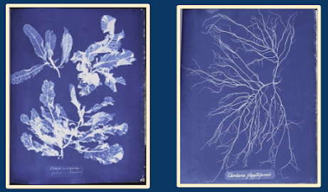
• Anna Atkins: Botanist and photographer. Engravings of shells and fossils. Main body of work - photographs of British algae (cyanotype) process of algae and seaweed forms in the south of the UK. Benefits of that process, categorising. Impressions and forms, through light. Considered to be the first book of scientific photographs. Photographic history - we often talk of the invention - but the context of it, the usage of it, the studies of it, gives it meaning. How we see images in a space. Contributions to scientific canon through the process of illustration - through patterns, thinking, observing. As illustrators, output was overlooked as they were women in a certain point of time.
• Processes and outlook has impacted and influenced how work and research is approached
• Rocks, seaweed, systems, little worlds, washing on and out twice a day. Rock falls. Edge of the Sea by Richard Carson.
• Quote. Studies. Sketchbooks
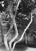
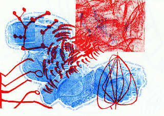
• Close looking, roots, systems, intertwined. Interest in systems. Collage, diagram.
Monday, 28 October 2019
Contextual Research for LAUIL503 Studio Brief 2: Dracula

Saturday, 26 October 2019
Eureka Moment: Visit to Yorkshire Sculpture Park
I would have loved to experiment with lino printing more as I was really getting into it! I mocked up a few things in Photoshop that I would have done if I had more time:
Wednesday, 23 October 2019
Lunchtime Lecture Series - Matthew Hodson
• Improvisation and drawing as performance
• My research is about drawing. Where drawing is used as primary image making for illustrator
• Interested in the common themes of drawing practices. carrying hand and voice of the maker
• Authorship, de-masking, truth, manifestation
• Always enjoyed the looseness of Quentin Blake, there's a performance and movement to his illustrations that is distinctive and immediately recognisable as a Roald Dahl book
• Drawing is simplest way of establishing vocabulary, instant personal declaration of what's important
• Drawing over and over and over. Repeating. Iterating. Mystery comes from practice. Playful, compulsive, experimenting, wonder, practice to unconscious skills, trading between conscious and unconscious.
• Identity, establish, incubate, stain, evolve
• Authenticity. Play, taking risks, experimenting, improvisation, experience and skill
• Style is not a trend, not a fixed outcome, not a tool. It's an emerging practice, organic, relationship
• Emerging from the unconscious. Improvisation is generative. Forms of culture. Accord. Relational, response certain duration. The thrill of making it up
• Creativity comes from interaction containing framework, containing rules of the symbolic domain, individual who innovates brings novelty to symbolic domain.
• We are born with two sets of contradicting instructions - conservative instincts, self-preservation, saving energy, solving rational problems that have a correct answer. Expansive tendency exploring, enjoying risks and novelty. Divergent thinking with no solution, generation of great quality of ideas, switching perspectives, unusual association of ideas.
• We can be whatever we want to be!
• Quality of the experience, do not worry about the end point. Novelty and discovery. Gets rid of challenging activities.
• Immediate feedback and clear goals every step of the way, balanced challenge and skills, action and awareness, no distractions, no worry of failure, distorts time.
• Intrinsic motivation feels good
• Technique is boring, permanent, solid. Become used to knowing and set in our ways. Dangerous! Loses playful spirit, rigid forms of professionalism.
• Galumphing, play energy. Activity in young animals, children, communities. Your practice. It's exaggerated and excessive. Teeming. Drawing and performance.
Saturday, 1 December 2018
Contextual Research for LAUIL503

Monday, 22 May 2017
Friday, 19 May 2017
OUIL402: PPP Presentation
I will be using using cues from my iPad so that I know the things I would like to mention during the presentation.
Slide 1: I wanted to start by looking at my strengths and the interesting discoveries I’ve made this year that have impacted positively on my emerging practice.
Slide 2: The final outcome of my Pearly Kings and Queens book in Visual Narratives was something I was really, really proud of. As a research driven module, I was able to look at a variety of research methods from going on trip and having personal first-hand experiences, talking to key figures integral to what I wanted to research and find out, recording audio responses and soundscapes, drawing sound maps, photography, collecting ephemera - all telling a different story to what I would have learned if I’d just researched through websites and books. It became a very personal project because of the emotions and experiences attached to it and I think that really comes through in the final work. Roughs and storyboarding, making multiples and considering different ways to frame and compose the same image, helped to drive forward my understanding of images and how different narratives a told through how the visual is presented. Learning new skills in InDesign - a piece of software I had never used before - combining with photoshop collage and transferring my wide breadth of research into the visual were all challenges but eventual successes and my First reflects that. Contextual research was of high importance influencing and inspiring the aesthetic and tone of voice in my illustrations. Emulating Louise Lockhart, The Printed Peanut, who visited us during this time changed the way I make pictures and gave ma feeling of renewed excitement for picture books. I want to be able to take the foundation of knowledge from this successful module and transfer it to the work I make next year in response to more complex and thorough modules.
Slide 3: Visual Language was successful for me in terms of allowing me to look at my current practice to take apart in a diagnostic fashion - rebuilding it again from the very basics. Particular sessions that inspired me were the line quality, texture and collage sessions - giving me the space to let go of the perfectionist approach I had before of drawing very realistic-looking work which was very representational and had little to do with my own experiences or my own tone of voice. Observational drawing was, as you can image, extremely difficult but this allowed me to have artistic license and learn, personally, the difference between illustration and fine art. I can omit information and keep in the things I see or think are important.This shows my distorted lens, it tells a narrative, and captures an audience much more.
Slide 4: Visual Communication was my most successful module. Both in terms of grade (at 75%) and in terms of learning. As the final module for the year, I really fought to question and challenge my intentions as an illustration and ask myself what work do I want to make and why? What do I want to communicate to someone looking at my work? I chose the opposite to what I would have picked on first glance to get some interesting results which were very professional and very design-based. Totally unexpected of me! I gained many new skills including how to make GIFs in 3 ways, creating vectors in Illustrator, photograms and photography which was totally foreign to me but something I wanted to pursue independently, and vac forms of clay models I made. All embodied a new perspective of seeing and making through the work of architect Zaha Hadid - important to me as a trailblazing woman in the architectural field but also her perception of how forms should work in her deconstructionist and fragmented way. Her own life experiences as a child living in Iraq influenced her to apply interesting ‘skins’ to buildings and looking towards nature for organic forms.
Slide 5: I am very proud of what I have achieved through my studentship this year. As part of the student union as an exec officer, I have helped to shape the events we have at college as well as present a voice for disabled students and provide a platform for equality and accessibility. As student governor I have ensure the students are at the heart of all decision making processes and learned more about an institution I love. And winning student of the Year in November really celebrated the hard work and incredible journey I have had over the past 2 academic years in Access to HE and first year of degree - allowing me to reflect and project forward.
Slide 6: This year hasn’t been without its difficulties, however, both academic and personal. My severe visual impairment means that life is never going to be easy and I have struggled with studio space and obstacles left around such as bags and chairs, accidents I’ve had in my student accommodation, my guide dog having conjunctivitis earlier in the academic year, large class crits being difficult in terms of mobility, people walking into me, leaving feedback on the wrong pieces of paper, not being able to read my own feedback. Context of Practice was difficult for me in terms of group work and often times being alone with Pete spotlighting me and the fact I was alone - making it even more embarrassing and awkward for my peers who clearly don’t want to work with me and that should be respected.
Slide 7: I have surprised myself with some of the discoveries I’ve made this year; from new artists to new reading materials and elements in my personal life. I decided to take up the violin earlier this year, synthesising with my creative flair and my problem solving skills. I’m not able to read sheet music due to low vision but have learned to play by ear and the process of iterating and repeating notes and songs until they are professional sounding - and can then be improvised - marries with that of my illustration process. I have rediscovered my faith which has been a comfort through the rollercoaster of highs and lows, allowing me to keep being charitable, helpful and with a feeling of purpose.
Slide 8: Op-Art is the biggest discovery I have made through a gallery visit where I happened across the work of Victor Vasarely. The strong contrast of black and white, varying frequencies of information and the interlocking shapes create a fascinating but also challenging experience for me and is something i want to learn more about. It begs the question of how we perceive imagery through our different lenses and what is read first. Is there a complex narrative? I want to uncover more next year.
Slide 9: In terms of future prospects, I have a number of things lined up. At the time of writing my presentation I had the Guide Dog Awards to look forward nowhere tami and I had been nominated for the Life Changing Partnership Award. I can now say that we won and just like the student of the year award it feels like such a celebration of all the hard work we put into our partnership and our university life. Tami has truly changed my life for the better and I wouldn’t be here without her. I was very kindly contacted by Davina McCall and ITV for their show ‘This Time Next Year’ where I will be undertaking a year-long journey of publishing my first children’s book - a dream I have had since a little girl where picture books were my only comfort in the months I spent at hospital in London having various operations and procedures. I want to be able to create an accessible book for all going beyond the sense of just sight - through tactile illustrations and Braille, audio CD, a hand-made toy that smells of ginger, and large print and beautiful images for sight children. Why can’t we all have the same book and the same package to enjoy together? I have also been invited to the Loogabraooga festival in October, in Loughborough, to give a seminar and workshop on how to create pictures with limited sight and through that have been out in touch with David Williams, Michael Murpurgo andd Michael Rosen - extending my network of contacts in the professional field.
Slide 10: Fundraising and volunteering really feels into my practice but also my personal life and the sense of helping others facing hardship and tribulation helps me to feel more fulfilled. This then influences the work I make through my personal experiences of giving and receiving compassion. I’ll be visiting Uganda this summer with East African Playgrounds helping to give creative plays sessions to disadvantaged children and teach them the value of play, art and creativity which I am really looking forward to. We are encouraged to take photographs and diaries when we are there but I will be recording a reportage sketchbook of the places I visit and people I meet to have a more unique and personal end result.
Slide 11: Moving onto level 5 and looking toward the future, I have the challenge of combining my new found love for op art with my core love of children’s books. What experiments and processes can I play with and what will be the final outcomes? What discoveries will I make? How can I embed my learning from visual narratives, visual language and visual communication? I will be working on my first children’s book alongside all of this learning which will feed into the end result shown on This Time Next Year. And in COP 2 I wanted to look more contextually at the relationship between shapes through Gestalt theory, analysing framing, grounding and out personal experiences and how those things affects the imagery we see.
Thank you for listening. Any questions!
Now I'm itching to get this presented!
Guide Dog Awards 2017
Well, I feel truly humbled and honoured! Tami and I won the Life Changing Partnership Award at Wednesday night's ceremony and I just simply cannot believe it! We have come so far this year and this is such a celebration of everything we have achieved together in our 2 and a half years of partnership. It was wonderful to be able to finally hear what Matt and Simone said about me during the filming in February! Thank you so much for the kind words, guys! :) Such a wonderful event with lots of incredible dogs who change lives every day, and full of inspirational Guide Dog owners who I can proudly call my friends.
I just feel so happy, so blessed with the gift that is Tami and so motivated to keep going in my journey!


