Monday, 25 November 2019

Live Show: Ghost UK tour

 Music and live shows are a huge interest of mine and I've recently followed my favourite band, Ghost, on the UK tour of 4 dates. Ghost captivate me with their intricate stage show, the masks and the satanic-lite hymns sung as their concerts or "rituals"

Ghost quickly became my favourite band in 2017 because of their striking costume design, use of masks, and their inspiration of theatrics, horror and performance akin to Alice Cooper and King Diamond. They subverting ad parodying what we know of the Catholic church and Pope, playfully making their satanic rendition of a "Devil Church" and Papa and Cardinal characters. The stage set-up looks like a church with a stairwell, chequered floor alluding to mastermind Tobias Forge's involvement with Freemasonry, and illustrated windows by artist Zbigniew Beilak. Rock and roll!

Costume design is overseen by B.Akerlund (Jonas Akerlund's wife) and her company, Majesty Black. The Papa characters are dressed in full chasubles and mitres, highly embroidered with inverted crosses. Papa swings a thurible during the song "Con Clavi Con Dio" filled with Nag Champa to start the ritual and there are many costume changes of cassocks and casual wear.

Their record sleeves and merchandise designs also borrow heavily from popular culture, putting a satanic twist on what has come before to create an idea of timelessness and familiarity. Art and movie influences include Salem's Lot, Amadeus, Jaws, The Silence of the Lambs, A Clockwork orange and Metropolis  which are easily recognisable designs to a cinephile.

Music has become incredibly important to me and I want to be able to imbue elements of Ghost into my own practice - combining multiple art disciplines and being playful, subverting what has come before to create something that feels new. Band merchandise has also become a strong interest and the illustrations applied to them and how they can transfer to various other formats.

Thursday, 14 November 2019

Contextual Research - Mary Blair


Mary Blair had a very strong modernist approach to her concept art, animation and designs with bold primary colours. Her strong use of colour and whimsical shapes used for recurring themes of characters, building and settings are what draws me back to her work constantly. There' strong movement and a sense of fun, liveliness and playfulness with her intentional paint brushes adding textures in the process, furthering the feeling of movement in a two-dimensional image. She builds her own worlds - something I would very much like to imbed into my practice. She elicits nostalgia for childhood and innocence. I love her work with Disney and Little Golden Books as those are what I associate her with, my own experiences, and the work I want to create - imbuing the concepts of characters and self-made worlds and creating whimsy and fancy,

Saturday, 9 November 2019

Eureka moment: Designing my Screen Print


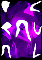
• Played with mixing both the "positives" and "negatives" cut off shapes of the fonts, filling the cut offs with the photography instead. Added some of the shadow play letters and changed the blending layer in Photoshop. Added some bats and then a Dracula-like figure to add focus to the centre of the composition. What will happened if the type isn't white? A mess! There is now no focus and no contrast. This isn't working! 

• Far too much going on at once with too many layers, the purple isn't working for me as there's too many tones. What will print out successfully and what won't once it gets transferred to black and white and printed onto coloured paper?

• I tried blue here and I just feel like the tone of Dracula is lost completely. I'm not happy at all with how much time I've spent on this and how overdone I'm finding it.
• Looking back to the contextual studies I did previously, simplicity is key!

• What now? I'm not even happy with the layout of the typeface and may redo the composition altogether as I'm feeling so limited and falling back into old ways of working. I'm no longer being inquisitive...


• This D looks like a Nosferatu face. It wasn't intentional but a happy coincidence. What if I arrange the letters in my type so that the D is at the top and the rest looks like a body? This is something I would never have thought of before but the previous and "typical" way of working has backed me into a corner that I'm not happy with.


• This is quite interesting! Because I used my hands for my type, it translates well to being Dracula's hands! My acrylic nails that I had professionally done really translate well too as vampiric talons. Nice! 
• What shall I do for the image layer? Something simple like a cape? Inspired by the arrangement of the lettering and the lights from the play...

• I used a digital watercolour brush that is affected by pressure as I wanted to mimic the lighting from the ballet and let that inform my work with that unique experience of witnessing the flow and movement


• Looking back at my contextual research, red, black and white were most successful to portray blood, lust, shadow, a dark character, themes of horror and a sharp contrast with white. Which elements do I want to colour which way? Adding fangs to the D! A nice use of negative imagery, basic shape and adding a focal point


• I had quite a central alignment composition which I felt didn't really say anything? So played with sizing and alignment. The smaller Dracula felt like he wasn't as imposing or threatening, a much quieter figure. The bigger one taking up more of the canvas felt more imposing. The right alignment gives a sense of him coming forth, looming towards and like he has moved. There is space behind him

• Overall this has been quite an exhausting and exhaustive process. Not having constraints to work with this time threw me a little bit, colour especially, and having that freedom and total control of the output is both good and bad as things can be overworked to oblivion as I did at first throwing everything at my first outcome. 

• Having constraints in place for yourself and not overworking something and keeping it simple is the key to a successful image and this has been a very strong learning point for me.

Wednesday, 6 November 2019

Eureka Moment: Creating my own Type


I crated my own type for the Dracula briefing and really surprised myself with how I approached it and the success from the approach I used. I can no longer use the graph and square papers that were provided and I started to panic in the studio when everyone else was approaching the problem this way. The way my practice was in the past, I would have let the graph paper and the need to be meticulous consume me and I would have been stuck down the hole for some time trying to create the most perfect set of type.

I no longer work in this way and I had to start thinking of how I would approach things now, as a bling practitioner. Well... I use my hands for everything. To feel surfaces to guide me, to read Braille... why not use my hands now? I have been getting my nails professionally done for the past few months and had almond shaped claws too!

Literally tracing around my fingers in different angles positions to create the letter I needed created this rather archaic aesthetic, alluding to the fact Dracula is an ancient being.


I scanned in the "off cuts" of paper, or the negative space, of my letters which creates an interesting language of shapes. A new visual language. I filled this with my photography from the graveyard behind Leeds University and the Yorkshire Sculpture Park.

Keep pushing a simple idea forward! What now? How can I use this in my screen prints?

Contextual Research - Helen Dardik


 Helen Dardik marries both traditional painting techniques of gouache, oil and watercolour with embroidery and digital media - printing her work onto cards, giclee prints, books and other ephemera. Her Russian background and upbringing strongly informs her practice with a folk-art inspired approach to illustration which is apparent in the recurring use of flora and fauna; animal characters and flowers. Heritage and childhood are both strong groundings to her work as well as childlike themes, the celebration of female characters and nostalgia. Dardik has a very jolly and bright tone of voice using bright neon colours and soft, rounded shapes and welcoming, smiling characters. I want to be more informed and have a stronger sense of self and be proud of my upbringing as Dardik is, potentially exploring my Irish working-class heritage and being playful with my background as Dardik is, I like her approach to blending analogue (gouache) and digital - I haven't really experimented with gouache paint before and may like to experiment this academic year in response to briefs