Wednesday, 30 October 2019

Lunchtime Lecture Jamie Mills

• Illustration as polymath.

• Illustration, theoretical, contextual. An okay text. All rounders, thirst for knowledge. Joy in the finding out stage. Solve specific problems. Renaissance idea of explorers and adventurers and artists and poets, wealthy people would be all rounders of various subjects. Asking meaningful and purposeful questions


• Da Vinci's and Ruskins. Illustrators are scientists and critical thinkers and musicians and zoologists 


• Beatrix Potter: We know her for her illustrated children's books but not her work with natural history. Natural forms. Groups and societies were only open to men. Women weren't open to the dialogue. Curiosity, attention to detail. Grounding and image making was in mycology. Fungi and algae. Considering taxonomy. Growth patterns, reproducing, spreading. Observing, studying. Spores. She was interested in reproduction of spores and theories. On the germination. Paper she wrote and accompanied by her images. London Society. Could only do that through her Uncle. Research presented on table and she couldn't be present as women couldn't be there. Her images are still produced in text books and journals today.


• Marie Neurath: German designer and scientist. Sociologist. Otto noira husband produced imagery in their society. Visual language. Based in Vienna, working at museum, met her husband there, renamed Social Economic Museum. Workshops. Civil War in Austria so they fled to the Netherlands. Engaging and graphically clear. Understanding. Complex. Simplistic forms. Nazis invaded the Netherlands and they settled in the UK in oxford. Otto died and Marie carried on until the 80s with children's books and how she could continue that foundation of research. Transforming that into an accessible format. Diagrammatic format. 


• Simple question with simple visual language.


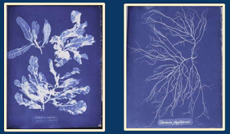
• Anna Atkins: Botanist and photographer. Engravings of shells and fossils. Main body of work - photographs of British algae (cyanotype) process of algae and seaweed forms in the south of the UK. Benefits of that process, categorising. Impressions and forms, through light. Considered to be the first book of scientific photographs. Photographic history - we often talk of the invention - but the context of it, the usage of it, the studies of it, gives it meaning. How we see images in a space. Contributions to scientific canon through the process of illustration - through patterns, thinking, observing. As illustrators, output was overlooked as they were women in a certain point of time.

• Processes and outlook has impacted and influenced how work and research is approached

• Rocks, seaweed, systems, little worlds, washing on and out twice a day. Rock falls. Edge of the Sea by Richard Carson. 


• Quote. Studies. Sketchbooks


• Close looking, roots, systems, intertwined. Interest in systems. Collage, diagram. 

Monday, 28 October 2019

Contextual Research for LAUIL503 Studio Brief 2: Dracula

Dracula cover illustration by David Mackintosh. I love the textured effect used on the cover design, it's very grungy and dirty to give the sense of ageing, decaying and weathering as well as visual interest to the areas of plain red, helloing to blend the darkness of the character in. The three way colour palette of red, black and grey to portray blood, lust, shadow and a dark character minimalistic, understated and doesn't overdo it - successfully creating a visual language of horror. The grey is especially nice as it's more muted, than if it were to be white, where the main focus of the image would then be on the stark contrast of the white text on the black of the background. The font choice is really pleasing, it's a classic-looking gothic font pairing well with a classic gothic literature. The larger 'D' makes good use of the left side of the canvas and, again, ties the blackness of the character into the image. The character design of Dracula is particularly well done - small, lithe features and a classic Nosferatu head with a huge batlike cape too big for the canvas. His gesture and movement from his feet show him to be prowling, spindly yet graceful like a spider.


Dracula cover by Luke Parker (Art of Parker), used for the Kindle 2014 illustrated edition cover, sold on Amazon. I like the basic 3 colour way, clearly representing the red of blood, the black of the cape and the white of a pale vampiric face. The red eyes against the white face bring automatic attention to the character and the demon eyes of the vampire - very clever use of colour! The simple shapes are strong, bold and angular; the harsh lines of the shoulders of the cape, the angled widow's peak of his hair, the triangular eyes. There's nothing soft or round or comforting. The use of negative image within the cape is also really clever, starting from the mouth to look like gushes of blood and extended outward to form something else. A river of blood? A mountain? It almost looks like an angled upwards view of a church steeple but I don't think that's what it is. It would have been really clever if that's what it was, or even one of his bride's extending an arm outwards to his mouth to look like blood. On the kindle edition I'm not a fan of the Dracula font at all. I used to use something very similar when I started using Photoshop in 2004 at 14 years old. It's very dated, very MySpace, and the extra space between the 'd' and the 'r' is rather annoying and serves no purpose. It's either a design error or part of the font. I wish something else had been chosen as it ruins the professionalism and immediacy of the illustration. 


Minimalist movie poster design for Frances Ford Coppola's Dracula by Will Holdsworth. Again, less is more! Using a flesh colour for the majority of the poster and red circles with lines to portray two puncture holes with drops of blood is very subtle but very immediate and effective in its context once we "get it" and understand what's happening with the help of the type. The type, again, is simple. No overdecorated or over-ornamented lettering. It's nice and clean... aside from the blood. One puncture hole dripping longer than the other gives a simple sense of movement and leads the eye down towards the title of the movie.

Saturday, 26 October 2019

Eureka Moment: Visit to Yorkshire Sculpture Park

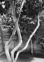
Photographs: 


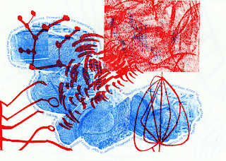
Risograph Outcomes


Lino Outcomes

Collaborative Lino


I like the prospect of "experiential art" much more than I initially thought I would. The Yorkshire Sculpture Park was a beautiful location to just enjoy making and creating in different ways that I wouldn't have associated with my practice a number of years ago! Responding to sound, texture and my own words, rather than the visual, really pushed me out of my comfort zone but it was rewarding to find I can still make art with other processes. My initial worry was that this was going be an observational drawing exercise and, as someone who has lost the majority of their sight this past year, the trip filled me with slight terror. Learning more about experiential art, logging my personal journey and my own responses made this so much more individual and integral to my self-growth as a person and an illustrator. Being outside and amongst nature, rather than in the studio, was extremely therapeutic and advantageous for my outcomes and my mental health showing a positive effect in my work. To be working with constraints of particular colours, sizes and within a certain time frame helped me not to overthink these aspects, as I often do. I found the collaboration part of the brief difficult as it is hard to relinquish control of my work but I was surprised by the outcomes of the risograph prints and how well my pieces work well with someone else's in terms of the composition. The lino collaboration was a struggle as someone had printed twice instead of leaving a space for me and when we tried to redo it, not everyone reprinted. This has soured my feelings of collaboration and furthering thoughts that mistakes are made in groups, rather than working solitary, and not everyone is mindful of others and their abilities. To be made aware of a collaborative booklet with my peers, putting my work into a printed context, conveying visual language of the Yorkshire Sculpture Park is a delight. We all went to the same place but experienced different things!
didn't have as much time in the print room with lino as I'd like, with having a small group of people also using the facilities and a limited amount of time for demos on cutting, inking, using the press, hand printing and cleaning up the inks and tools. It took me a little while to carve out my lino stamp just how I wanted it, with limited vision and no sighted assistance, which I am very proud of! I was able to complete one hand print, one Albion press print and one ghost print along with one red and blue print for the group collage. As soon as those were done it was time to clean and out things away.

I would have loved to experiment with lino printing more as I was really getting into it! I mocked up a few things in Photoshop that I would have done if I had more time:


I love how playful these are, adding another dimension to my sculpture park experience, mixing colours, angles and ghost prints, and filling the canvas in different ways. 

EXPERIMENTING MAKES ME EXCITED!

Wednesday, 23 October 2019

Lunchtime Lecture Series - Matthew Hodson

• Improvisation and drawing as performance

• My research is about drawing. Where drawing is used as primary image making for illustrator

• Interested in the common themes of drawing practices. carrying hand and voice of the maker

• Authorship, de-masking, truth, manifestation

• Always enjoyed the looseness of Quentin Blake, there's a performance and movement to his illustrations that is distinctive and immediately recognisable as a Roald Dahl book

• Drawing is simplest way of establishing vocabulary, instant personal declaration of what's important

• Drawing over and over and over. Repeating. Iterating. Mystery comes from practice. Playful, compulsive, experimenting, wonder, practice to unconscious skills, trading between conscious and unconscious.

• Identity, establish, incubate, stain, evolve

• Authenticity. Play, taking risks, experimenting, improvisation, experience and skill

• Style is not a trend, not a fixed outcome, not a tool. It's an emerging practice, organic, relationship

• Emerging from the unconscious. Improvisation is generative. Forms of culture. Accord. Relational, response certain duration. The thrill of making it up

• Creativity comes from interaction containing framework, containing rules of the symbolic domain, individual who innovates brings novelty to symbolic domain.

• We are born with two sets of contradicting instructions - conservative instincts, self-preservation, saving energy, solving rational problems that have a correct answer. Expansive tendency exploring, enjoying risks and novelty. Divergent thinking with no solution, generation of great quality of ideas, switching perspectives, unusual association of ideas.

• We can be whatever we want to be!

• Quality of the experience, do not worry about the end point. Novelty and discovery. Gets rid of challenging activities.

• Immediate feedback and clear goals every step of the way, balanced challenge and skills, action and awareness, no distractions, no worry of failure, distorts time.

• Intrinsic motivation feels good

• Technique is boring, permanent, solid. Become used to knowing and set in our ways. Dangerous! Loses playful spirit, rigid forms of professionalism.

• Galumphing, play energy. Activity in young animals, children, communities. Your practice. It's exaggerated and excessive. Teeming. Drawing and performance.